Anna Frangogianni, Game Growth BD Manager | Mijiba
Table of Contents
In my earlier article on strategic ASO, I covered five key things to look out for during ASO metadata optimization. In this second part of the series, let’s look at five mistakes to avoid with your Conversion Rate Optimization (CRO) strategy, which focuses on the creatives used for the respective store pages.
You’ve spent so much time building a great game—doing justice to that impressive work means ensuring store visitors get a good taste even before downloading it. That’s why it’s so important to prioritize CRO and creatives.
Let’s explore five common mistakes to avoid, and how to tackle them.

The main purpose of your game’s screenshots is to grab a potential player’s attention. They should highlight both core gameplay features and storytelling elements. The goal is to communicate what makes your game unique.
Tip: While your first three or four screenshots tend to get the most views, this doesn’t mean some users won’t swipe through all of them. Test, test, and test until the content and order of your screenshots bring you the highest possible conversion rate. Yes, the order can make a difference.
Learn your audience’s preferences and tailor screenshots to appeal to your target country or region visually. Research what kinds of screenshots popular games in your genre use in your target country. You’ll start seeing trends.
Tip: Studying player preferences, as well as what your competitors are doing, will give you a good baseline to understand how culturally localized, relevant, and appealing your screenshots are.
Example:
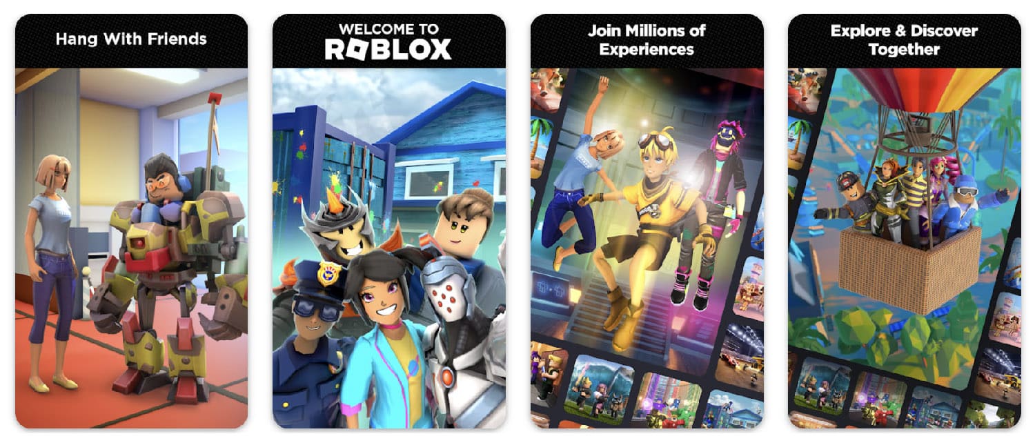
Notice that the screenshots from Roblox in the US Play Store are very clean and “simple” with a straightforward CTA (Call To Action) that highlights the game’s core features.

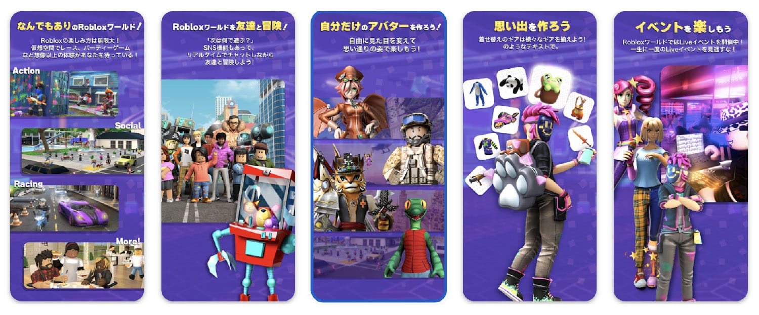
However, the style of the same game’s screenshots on the Japanese Play Store uses a lot more text and the layout is more complex, focused on highlighting many game features at the same time. The assets look “busier”.

Your gameplay screenshots and storytelling elements should be crisp and clean—this is what potential players typically want to see. A blurry asset sends a “this is a low-quality game” message.
The same goes for text: your CTAs should be relevant to your metadata, clear, and readable. Most people looking for a new game to download spend just a few seconds looking at screenshots—and if the CTAs are not clear from the get-go, users will likely not spend time to try and find them in your screenshot.
Tip: When deciding on final creatives, put on your consumer goggles. Remember that everything you do sends a message. What is the message you’re sending with your creatives and how can your CTAs complement this message?
Icons are the digital equivalent of an old-fashioned shop window display. It’s your potential audience’s first contact with your game; you need to make it count. Potential players should get a clear sense of what the game is about without being overloaded by visual clutter.
Your icon should match your game’s aesthetic. Players unconsciously base their expectations on the icon and will be disappointed if there is a mismatch. Another rule of thumb: avoid using text in your icon. The exception is when a game already has a strong, recognizable text-based logo, like FIFA.
Tip: Study popular game icons for common patterns. What icons do successful games in your genre use? Is there a common theme or structure? Apply the modeling (not copying) approach and test until you find a winner.
In these top puzzle games, note the general lack of people and brief intro to the gameplay, in the icons.
Yet, the opposite appears true in games similar to Idle Heroes.
Having a strategy for ratings and reviews is essential, and you ignore it at your peril.
Your reviews are a great source of information for incoming players and an indicator of the customer service they can expect. When they see a history of thoughtful, responsive replies, users are more likely to download the game, so make sure to respond to reviews, both positive and negative.
Plus, a high volume of high-star ratings from players also triggers store algorithms to improve your game’s ranking and overall visibility. The more people enjoy your game, the more weight your keywords will have.
Tip: We know developers are busy people–tools like Fancraft leverage AI to make your ratings and review strategy painless and seamless, taking work off your plate.
If you’ve gone through this list and found areas where your game’s creative/CRO strategy falls short, it’s never too late to make positive changes. You also pave the way for a more effective user acquisition strategy by tackling these issues.
And if you’re launching a new game, do not cut corners on creatives. Putting in the effort to ensure quality, testing, and iteration is the only way to succeed.